Of the bits of Australian this-and-that that Danny and I did manage to take in, the takeaways reside in the realms of architecture, art, and urban landscapes. (This may not surprise our faithful readers.) These impressions are as fugitive as was our time in the Land Down Under en tout, but there’s no stopping the camera from shooting what it shoots (deliberate cognition plays at best a supporting role), and once images become digitally imprinted, a record of sorts emerges.
Architecture first. Australian cities, or at least Sydney and Melbourne, are organized more like Boston than like New York City, meaning that a relatively small core, usually coincident with the Central Business District, constitutes the eponymous legal municipality, and surrounding it are progressively expanding arcs or rings of suburbs. What differentiates Sydney and Melbourne from Boston is that the size of that inner core is really small, so once you start walking away from the core the suburbs start almost right away. Still, as in Boston, Sydney and Melbourne’s inner suburbs contain older as well as new buildings; spatially, their layout varies, and they bear traces of an orientation toward pedestrians. We’re told that as the distance from the urban core increases, Australian suburbs’ density diminishes, along with the varieties of experience they offer.
The parts of Sydney we walked through to get from Rushcutter’s Bay, the suburb where we stayed, to the downtown harbor area took us through many ranges of tiny, older residential buildings, some in wood, 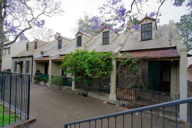
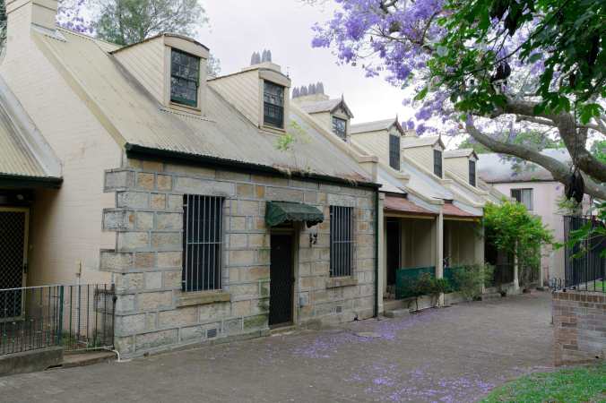 and others masonry. A few of these areas snuggle up to, or surround a little open area akin to a village green– below, look how some kid just dropped her bicycle and walked in her front door with no thought of locks or bike stands. Just as we all used to do, growing up. Right in the middle of Sydney!
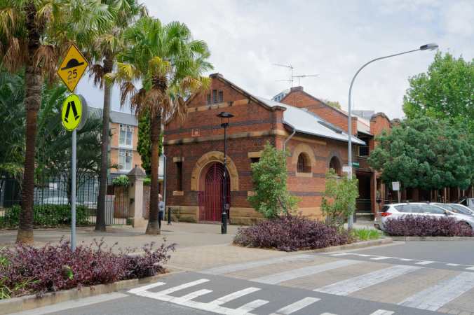
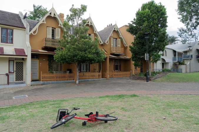 Nearby stood larger buildings that served the original community — perhaps a library, a school, a church. What the building below was or now is remains a mystery, but it’s fairly typical of the small Victorian public infrastructure in both Sydney and Melbourne.
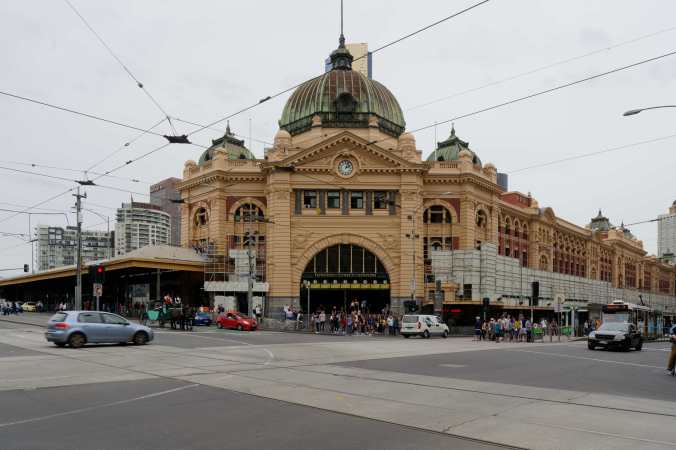
Then there’s the more majestic stuff. Victorian architects in Australia, it seemed to me, relished their distance from the stodgy old colonial mothership. They seemed to take a good deal of enjoyment in designing over the top– these two building are both in Melbourne, the bottom is the central train station on Flinder’s Street.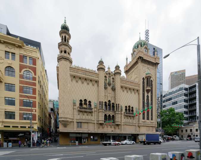
Others, of course, contented themselves with Monumental and Sedate. This the former Royal Mail Exchange Building, now the Whitehouse Institute of Design in Melbourne. 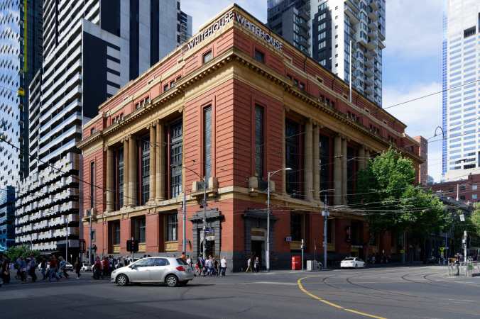 That red-brick/yellow-ochre detailing is a common combination in public buildings in both cities.
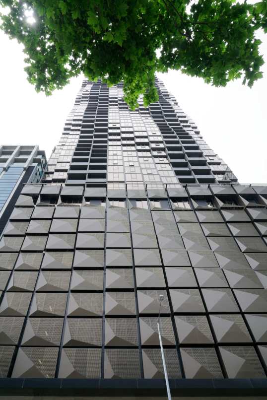
As for more recent buildings, our impression was that the general design quality is higher than in the US — see below, an ordinary luxury residential tower, where the architect at least tried to entertain the eye as it travels, wittingly or not, from base to crest.
Then, there was the special. I’ll wait on a wonderful project by the ever-uneven Jean Nouvel, because it fits best into the urban landscape entry, but here’s a surprising success by the also ever-uneven Frank Gehry, a business school at the University of Technology Sydney.
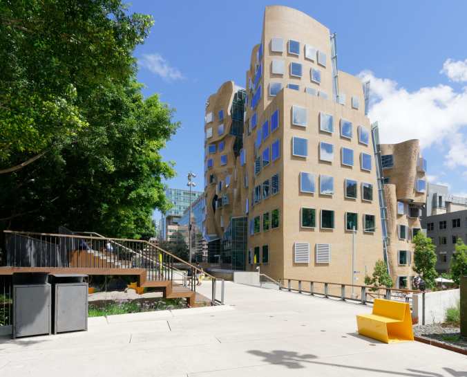
The canting of the windows on the exterior did just wonderful things with the clouds. (Lucky we caught it on a nice summer day.) And the texture in the brick façade, created by projecting and recessing passages of bricks as they followed the building’s complex curvature, was very successful. 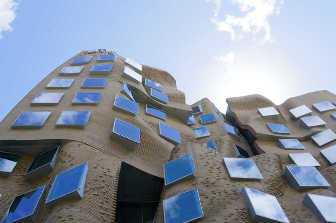
Inside, the building had the same spatial mess of “some cool moves and a lot of afterthoughts” that I’ve come to expect in most Gehry buildings, except the superb Guggenheim Bilbao. Here, the cool move was an element built up of wood blocks that looked as though it fell out of some Brobdingnagian child’s playpen. 
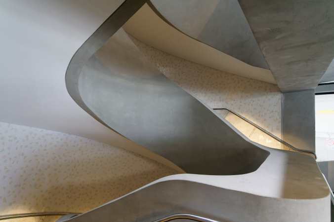
The real treat was seeing the Melbourne School of Design, designed Nader Tehrani of NADAAA and John Wardle of John Wardle Architects, which, in the central element-within-atrium motif, may look similar, but I assure you, the resemblance is only superficial. I will write about the masterful MSD elsewhere, so I’ll spare my breath and fingers here. Here are a couple of images, though.
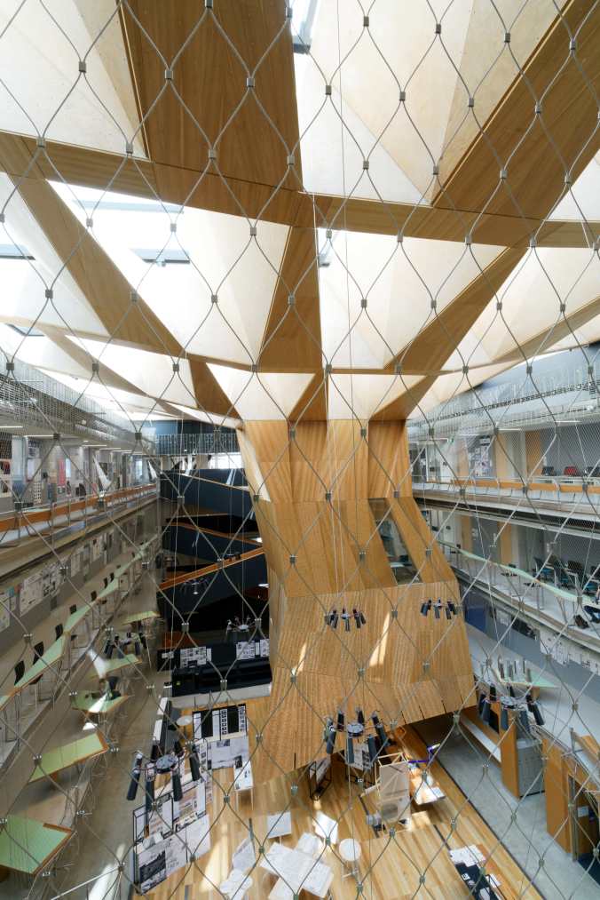
The architects transformed the internal corridors into habitable spaces (see tables and desks at left) and the wire mesh allowed them maintain a degree of visual openness to other floors while abiding by safety regulations.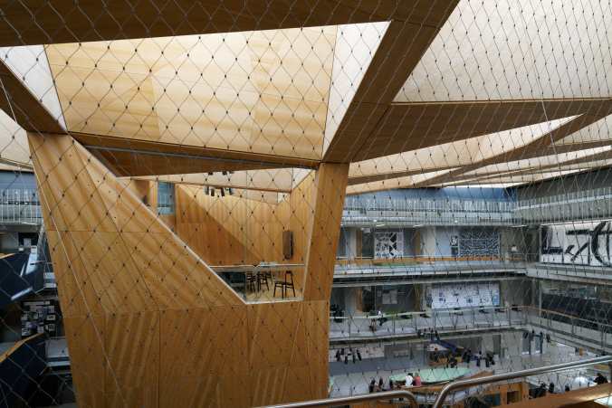
Through that crisscrossing network of family relations that life is, Nader introduced me to John, with whom I spent a good deal of time. One afternoon, Danny and I scoped out a library he did for the Melbourne Grammar School, a tony private school whose original buildings must have been designed with Oxford or Cambridge in mind. 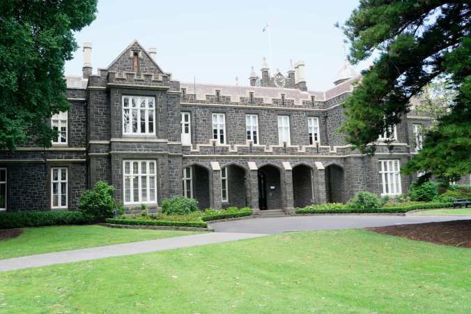
Respectfully, Wardle did something very different, with some beautiful details, inside and out.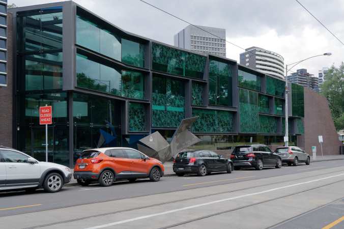
Look (below) how the vertical brick headers (are they headers?) project out of the surface as the wall’s plane cants back! 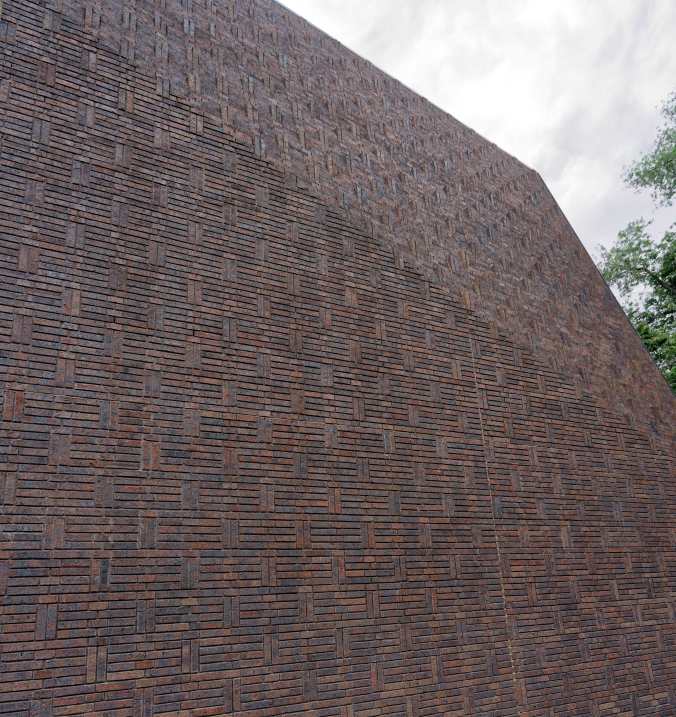
The library’s stacks become an object of curiosity when you get just a peek, from above. 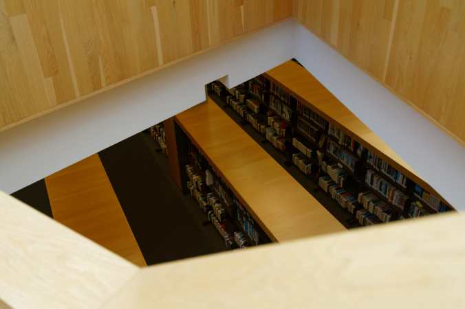
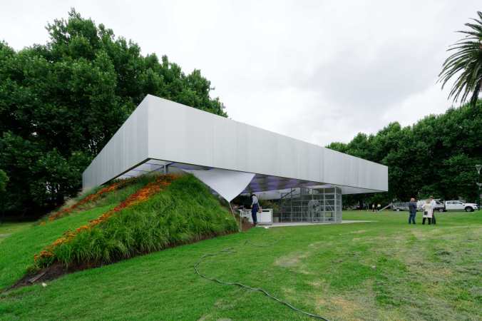
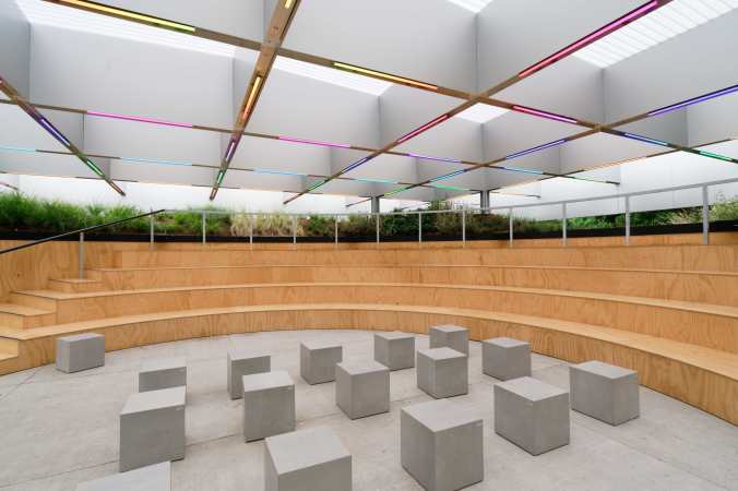
We also saw OMA’s MPavilion 2017 in Queen Victoria Gardens, just because. When you’re passing something branded “Rem Koolhaas”, you stop to poke around a bit– although in this case, not even long enough for a cup of coffee.
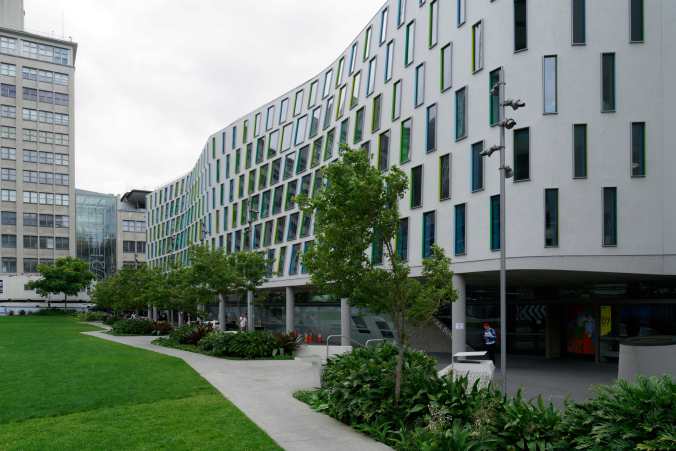
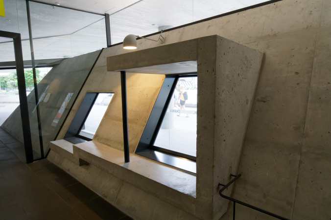
Finally, a very nice new building which is the cornerstone of a billion-dollar campus upgrading ongoing at the University of Technology Sydney, by Durbach Block Jaggers, buddies of John Wardle. Appropriately enough, it houses the Graduate School of Health. A ton to say about this one, too, but I’ll just leave you with teasers and eye candy.
— Sarah

Thank you for sharing! When I visited Sydney and Melbourne I also found the architecture to be very impressive. Although you state it very eloquently! Can’t wait for the longer posts wherever “elsewhere” may be.
LikeLiked by 1 person